
Yukka - Portfolio Dashboard Redesign
.png)
About Yukka
Yukka Lab is a Berlin-based fintech company that helps financial professionals understand and act on market-moving events. Their platform combines AI-driven news analysis with ESG, risk, and investment insights, enabling portfolio managers and analysts to make faster, more confident decisions.
Context of dashboard redesign
During client check-ins and onboarding sessions, the portfolio view was repeatedly highlighted as difficult to grasp. Portfolio managers described it as overwhelming and hard to navigate, with scores and signals scattered across multiple views. This made it challenging to quickly assess performance and identify risks.
To address this, I led a redesign of the Portfolio Dashboard with the goal of creating a cleaner, more focused experience. The new design consolidates ESG, risk, and investment scores into a single view, supported by intuitive filters, trend analysis, and contextual event annotations. This enables managers to cut through noise, spot underperforming companies faster, and make more informed decisions based on early, meaningful signals.
Dashboard Restructuring and labelling addition
Lack of focus:
Across the dashboard, users felt overwhelmed by the variety of scores and the lack of structure. With every metric available to be added anywhere, the experience became fragmented and unfocused. Portfolio managers struggled to understand what to prioritize.
Lack of guidance:
Across the dashboard, users struggled not only with the amount of information, but also with the lack of clear guidance on what the data actually means. Numbers and scores were presented without interpretation, leaving portfolio managers unsure how to act.
Lack of focus:
To bring clarity and direction, I restructured the scoring model into four distinct focus areas available as tabs in the dashboard:
- Overview: Quick snapshot of portfolio health and biggest movers.
- ESG: In-depth breakdown of Environmental, Social, Governance scores.
- Invest: Metrics relevant to investment opportunities and performance.
- Risk: Key risk scores
Lack of guidance:
- Added labels that translate numbers into clear meaning (“Strong”, “Needs Attention”).
- Used color coding to indicate urgency and direct attention.
- Introduced contextual cards linking score changes to events (e.g., “Lawsuit” driving governance drop).
%203.png)
List of Companies Component
Clarity and Focus:
Multiple raw values (ESG, ΔESG, ΔVol, BB etc.) shown side by side make the table difficult to read. Users asked for sorting by ESG, risk, or investment categories, instead of manually scanning across metrics. Adding additional scores risks overwhelming users. A more organized, clustered table would make the view clearer and less intimidating.
Company-Level Insights:
After spotting Tesla or Nestlé underperforming, users want to click directly into that company to see the why, which is missing in the current component.
Clarity and Focus:
- Introduced interactive sorting and added : clicking on a score reorders the table, surfacing the most impacted companies first.
- Ordered ranking and consistent formatting support quick benchmarking, while contextual event links set the stage for comparing companies within their sector or index.
Company-Level Insights:
by Clicking on a company row will change this dashboard into a company level insight dashboard
.png)
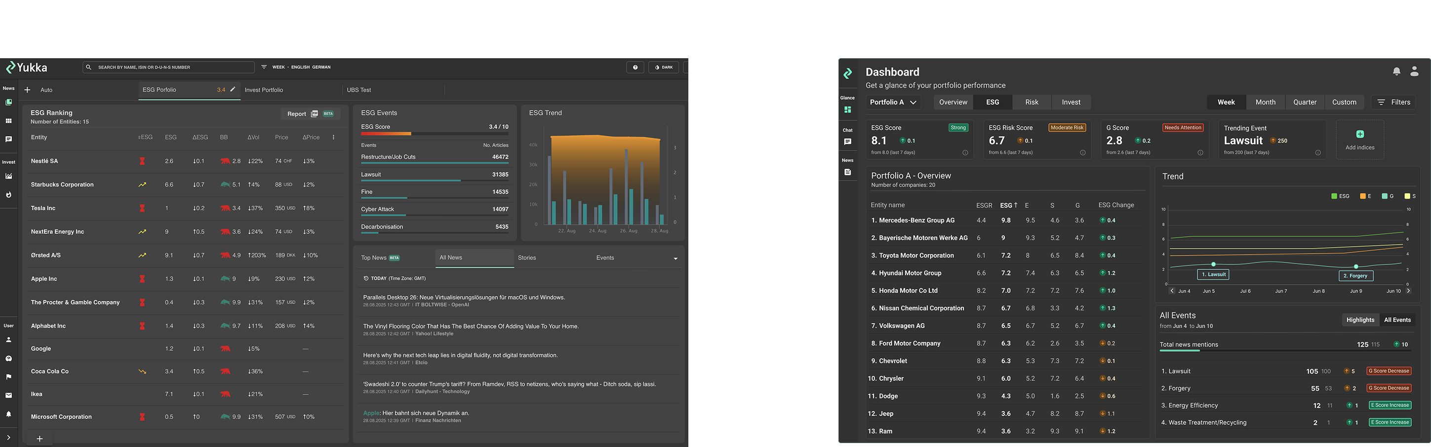
List of Events component
Lack of meaning:
- Events appear as a list of categories with article counts but lack direct linkage to the score changes in the portfolio view
- Users often miss which event explains a specific spike or drop in ESG score.
- Missing Labels & Explanations: Top events should be clearly linked to the portfolio trend, so users understand why a change happened.
Lack of meaning:
- Highlight event → show corresponding score impact (spike/drop).
- Provide quick labels or annotations indicating which score is affected positively or negatively by this event
- Make event-to-score connection visual and immediate, reducing cognitive effort.
Newsfeed component
Missing link to scores:
News appears disconnected from portfolio/score changes. Users can’t see which article explains a spike/drop.
Not being used:
Users often ignore the feed because it doesn’t help them answer “why did this score move?”
Too many news items:
Overwhelming number of headlines with duplicates and noise.
Too many tabs:
Fragmented navigation (Top/All/Events/…) increases effort.Users feel lost:
No prioritization or guidance on which articles actually matter for the portfolio.
From News → Event Instances:
Instead of raw headlines, articles are clustered into event summaries (e.g., Lawsuit, CEO resignation).
Each summary card shows:
- Short title + descriptionSeverity / impact on scoresLink to representative article (others collapsed behind)
- Clickable cards with clear redirects
Cards link directly to the most relevant article that explains the score change.
- Noise reduction
Duplicate headlines collapsed into a single event card with an article count.
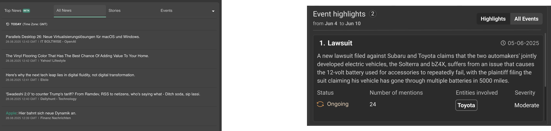
Chart - Score trend component
Missing link to events:
Users saw score drops/spikes but couldn’t tell what caused them.
Context switching:
To understand a change, they had to leave the chart and dig into the newsfeed.
Overloaded presentation:
Too many lines and raw scores cluttered the view, making interpretation difficult.
Lack of legend:
Without a clear legend, users struggled to know which line represented which score (ESG, Risk, Invest, Governance, etc.).
Not actionable:
The chart showed movements but didn’t guide users toward meaning or next steps.
Event-linked annotations:
Drops and spikes are now annotated with clickable events (e.g., Lawsuit,Forgery).
Direct linkage to scores:
Hovering a point highlights the related event and shows Δ (e.g., “−0.8 Governance due to lawsuit”).
Simplified presentation:
- Reduced clutter: one clear trend line per focus area (Overview, ESG, Invest, Risk).
Added legend:
- A clear legend indicates which line belongs to which category, improving readability and reducing guesswork.
Integrated workflow:
From chart → event card → article, users can now trace movements to their cause without leaving the view.
Final Redesign Dashboard
.png)
Conclusion
Through user research, usability testing, and close collaboration with clients and stakeholders, I identified that the portfolio dashboard was powerful but overwhelming. Users felt lost in scores, struggled to connect numbers to meaning, and lacked guidance on what to prioritize.
By redesigning the experience, I:
- Reduced noise and cognitive load by structuring scores into four focus areas (Overview, ESG, Invest, Risk).
- Improved clarity with organized tables, clear hierarchies, and interactive sorting & filters.
- Strengthened guidance through contextual cards, labels, and legends that explain not just what changed but why it matters.
- Created a consistent “score ↔ event” linkage across the list, chart, and newsfeed, turning raw data into actionable insights.
- The result is a cleaner, more focused portfolio dashboard that surfaces risks and opportunities early, supports faster decision-making, and restores users’ sense of clarity and control.
Reflection – What I Could Have Done Better
Looking back, there are areas I would improve in a next iteration:
More longitudinal testing: While usability sessions confirmed improvements, longer-term adoption studies with portfolio managers would give deeper insight into how the redesign affects daily workflows.
Stronger data-visual alignment: The chart redesign focused on clarity and event linkage, but exploring more advanced data-visual patterns (e.g., small multiples, comparative benchmarks) could further enhance insights.
Prioritization guidance: Labels improved clarity, but an additional “recommended next step” or alert system could make the dashboard even more actionable.
Cross-role perspectives: Most research focused on portfolio managers; involving compliance officers or analysts more deeply could have uncovered secondary needs earlier