
CHER
A car sharing app for her


About project
Cher is a car-sharing app conceived for women to feel safer and encourage them to do a positive impact on the environment by sharing their rides with other women close by.
Cher is a car-sharing app conceived for women to feel safer and encourage them to do a positive impact on the environment by sharing their rides with other women close by.
I had the opportunity to do a 24 hours challenge based on a given problem space. 7 teams participated in this challenge and by groups of 4, we had 24 hours to understand, define, develop, deliver and code our solution.
How might we develop a digital solution (or use technology) to support eco-friendly systems and have a greater societal impact in clean energy?

After a team brainstorming session to select an industry for our eco-friendly solutions, we collectively chose to focus on the car industry, with a specific emphasis on car sharing. Morgan and I gave ourselves 45 minutes of interview 3 people's each to find out possible pain points when sharing a car. We were the only team at out 7 to dedicate some time to do interviews and was a real plus to determined our targeted users. 4 of the interviewees were women and we found out that they all struggled with car sharing because of two main reasons: Safety and Trust

Age: 23
Status: Single
Location: London, UK
"I would love to reduce my carbon footprint by sharing my car every day with someone I trust and feel safe with"
Goals: I want to choose a person I can trust to share my car with based on the person's gender and personality so that I feel safe while making a good impact on the environment by reducing my carbon footprint.
Pain points: I don't want to share my car with a different person every day and don't feel safe if I share it with a man.


• App exclusively for women
• Each profile is verified
• User can read each profile’s past ride ratings
• They can choose who they want to suggest a ride to based on the person’s hobbies/Personality
• Users can see how much carbon footprint they are saving by doing this ride

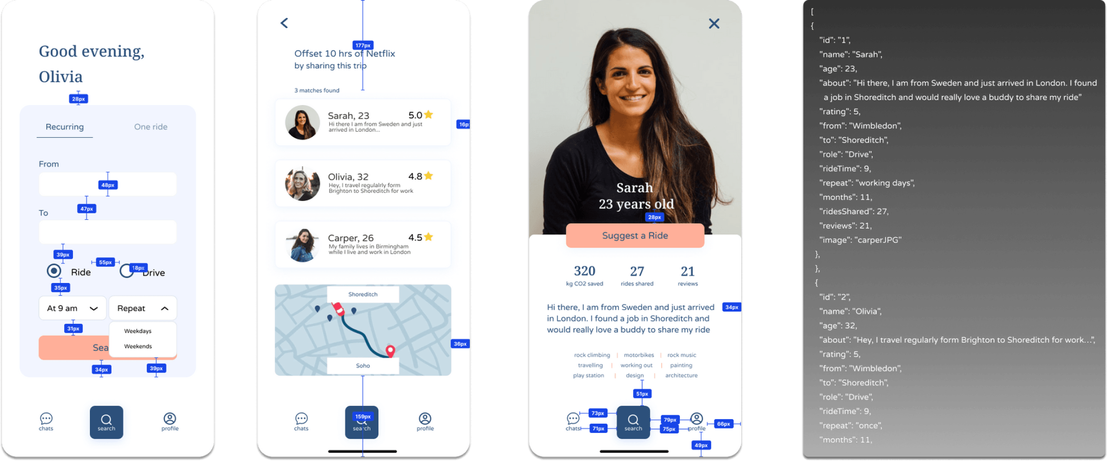
As it was a 24 hours challenge, we asked the web developers' team how many screens they could do to minimize the steps and adapt our task flow to what was possible to build. They told us they could do a maximum of 4 screens with simple interactions. We were in constant communication with the web developers' team to know if the features we thought about could be implemented into the app.


The color palette choices of blue in a car-sharing app designed to be safe for women are strategic and purposeful. Blue is often associated with feelings of calmness, trust, and security, making it an ideal choice for an application focused on ensuring a safe and comfortable experience.


• From - To input bar
• Time and day selection
• Frequency
• Carbon footprint saved indicator based on the ride
• Photo and bio of the matches
• Ratings
• Interactive map


• Photo
• Total CO2 saved
• Number of rides
• Number of reviews
• Bio
•Hobbies section
Now that the UX process is done, we asked the web developers' team what else we could do in order to simplify the coding process. In order to help them, we added spaces indicators between elements and implemented bio, matches name and age directly into the code.
What we did well
I am proud of our team because we could manage the pressure of the challenge well and were always in a positive mindset. Right from the beginning, we had a good communication allowing us to understand each other better and build trust within our team.
Robson, one of our team members got covid during this challenge but was still willing to give his best for this challenge. We had to be sure to keep him updated of any changes we made and maintain a good communication with him as he was working from home. With Morgan, we worked all night in order to deliver the final version of the product so that the web developers would be able to code early in the morning as we had our presentation at 3 pm that day and needed everything to be done by 2 pm.
What we would do differently
As it was the first time working in a 24 hours challenge and with web developers' team, we lost a lot of time at the beginning as with the pressure of the challenge, we did not follow the UX Design process correctly and were lacking structure.
Fortunately, one of our educators came to see us to reassured us and helped us settling the steps of UX design again. Once we were back on track, we caught up the time we lost and managed to deliver a project that we were proud of.

During our 3 minutes presentation, we had a lot of questions from the audience and people were really interested about our project which was really amazing to see. We were the only team who did user interviews, user testing and finished coding our solution entirely. I am really grateful to have worked with this team and have learned a lot about working with another designer and web developers.
